Design Guide
Using Origami in your project
We have a number of Figma Libraries available to support FT design work. This section will focus on using the Origami (o3) Figma libraries, which represent the latest version of Origami. To learn more about using Origami (o2), see the “o2” design guide.
Enable Libraries
The Figma Design System team includes the following projects:
- Origami (o3) – libraries for the latest evolution of Origami.
- Origami (o2) - libraries for the previous version of Origami.
- Documentation Assets - library & documentation templates for product teams.
- Other projects are product team projects – outside Origami, e.g. Internal Tools.
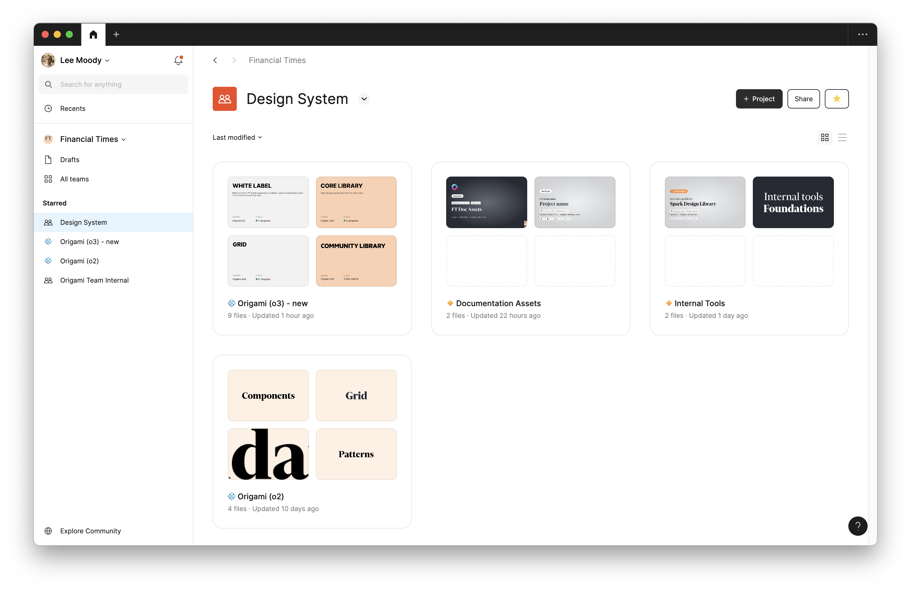
We recommend enabling only the libraries you need. For new projects these should be the “o3” library for your project’s brand, “o3” grid and iconography libraries, along with any library your product team maintain.
Figma Variables
Origami (o3) libraries ship with Figma Variables which represent Origami design tokens.
These tokens include values for colours, spacing, typography, and more. We have three layers of design tokens which build upon each other:
- Base Tokens: Fundamental, context-independent values.
E.g.o3/color/palette/paper - Use-Case Tokens: Tied to a specific context.
E.g.o3/color/use-case/page/background - Component Tokens: Specific to a component, usually internal and un-published.
E.g.o3/tooltip/background-color
Prefer use-case tokens where possible. As use-case tokens include semantic meaning we can use these to switch brands and themes for the same design. It also allows us to update values globally, based on how the design token is used. Never use a use-case token outside its intended purpose, for its value only, instead use a base token instead.
Where design tokens cover multiple states, for example links with hover state, the @ symbol may be used to identify the standard value:
o3/color/use-case/link/underline/@: The default colour of a link’s underline.o3/color/use-case/link/underline/hover: The colour of a link’s underline when hovered.
Design tokens are used to align design guidelines here, Figma variables, and code. Using design tokens therefore aims to support collaboration between colleagues.
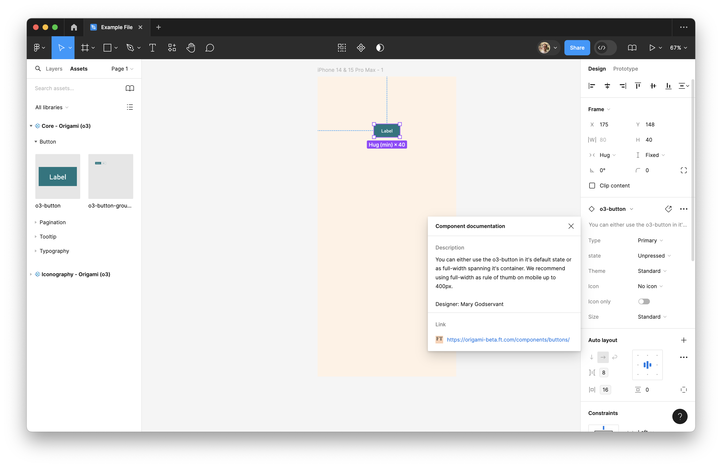
Figma Components
Origami components in Figma align with published components available to engineers and our design guideline website. See the description of an inserted component to jump to our design guideline website. This will cover where and why to use a component, along with some of the design thinking behind it. From there follow links to explore the component in Figma or live, interactive demos in Storybook.
Storybook Connect
Install the Storybook Connect Figma plugin to open live Storybook demos for Origami Figma components, right within Figma. This is helpful to explore a component in its fullest and test your expectations against the production version of a component.
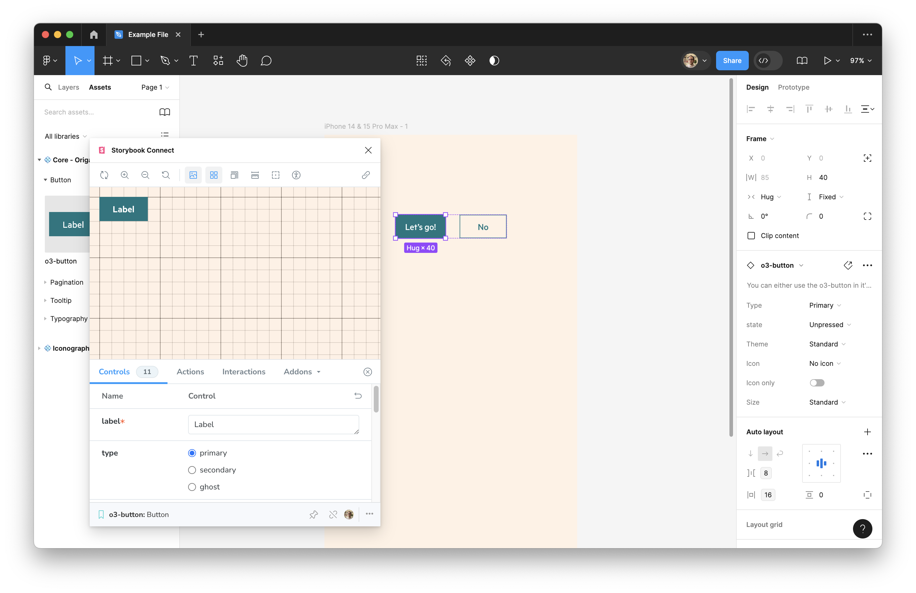
If you find a component which isn’t linked through Storybook Connect please let us know. You may also find the associated Storybook demos via the design guidelines for your component.
Collaborating with engineers
All FT engineers can access Figma’s dev mode, by requesting access from the #collaboration-tooling team.
Where a design uses Origami components, without detachment, the engineer implementing the design can use Figma’s dev mode to inspect what component variants to set, as there is alignment between Figma and released components. For example selecting this button shows what type and theme to apply. It also provides links for the engineer to reference Storybook and design guidelines:
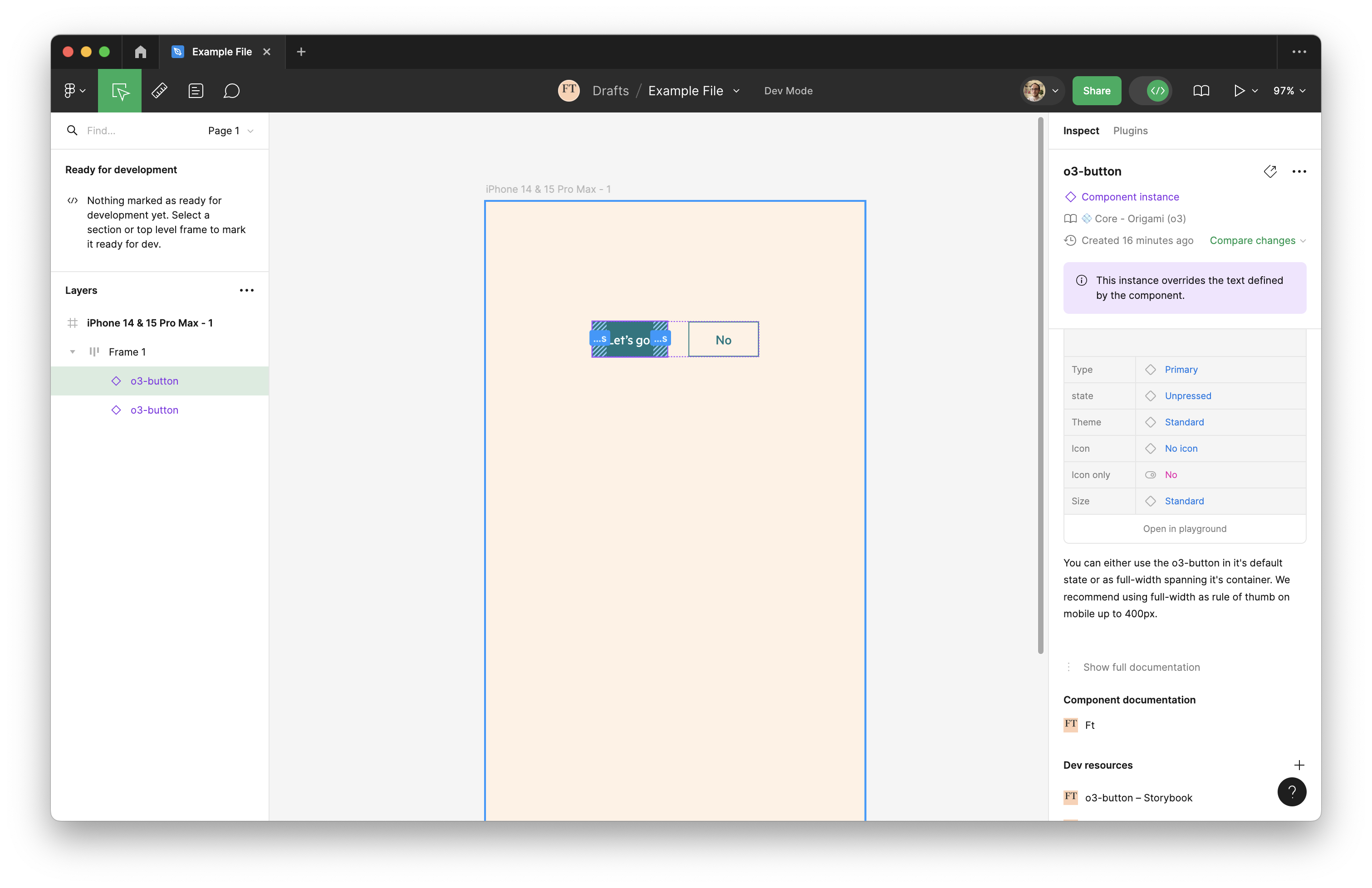
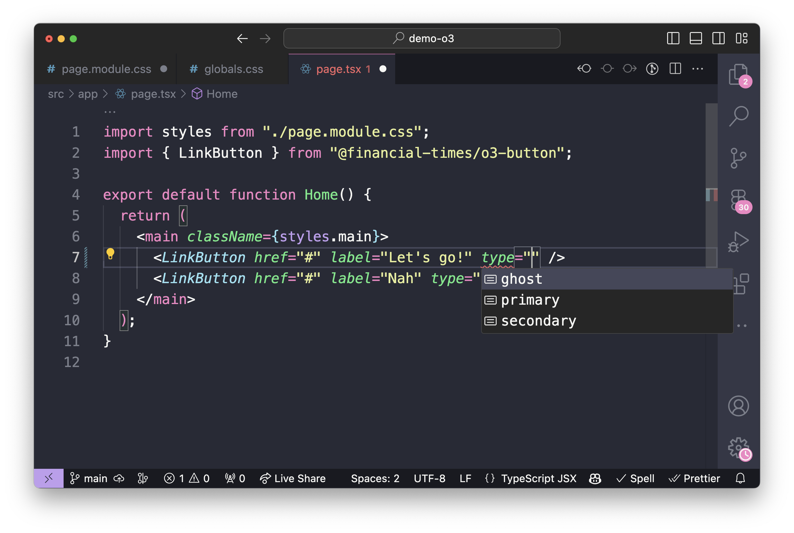
Here we see autocompletion on the engineering side, with a choice of button types, which are visible in dev mode:
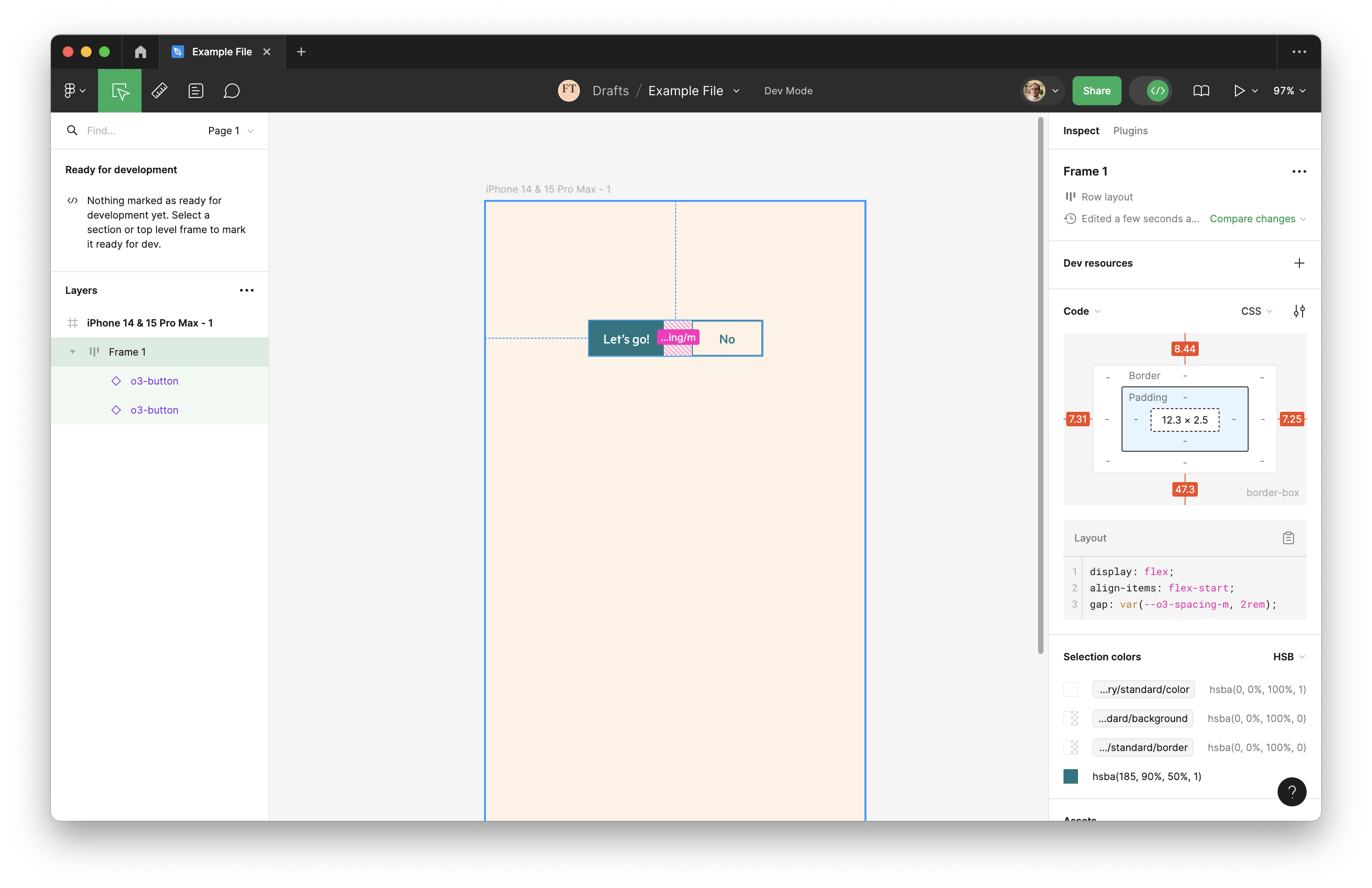
This principle also applies to Figma variables. In the below example we use the o3/spacing/m token in a Figma auto-layout. Within dev mode this appears as the CSS gap: var(--o3-spacing-m, 2rem). An engineer can copy this CSS directly from dev mode.
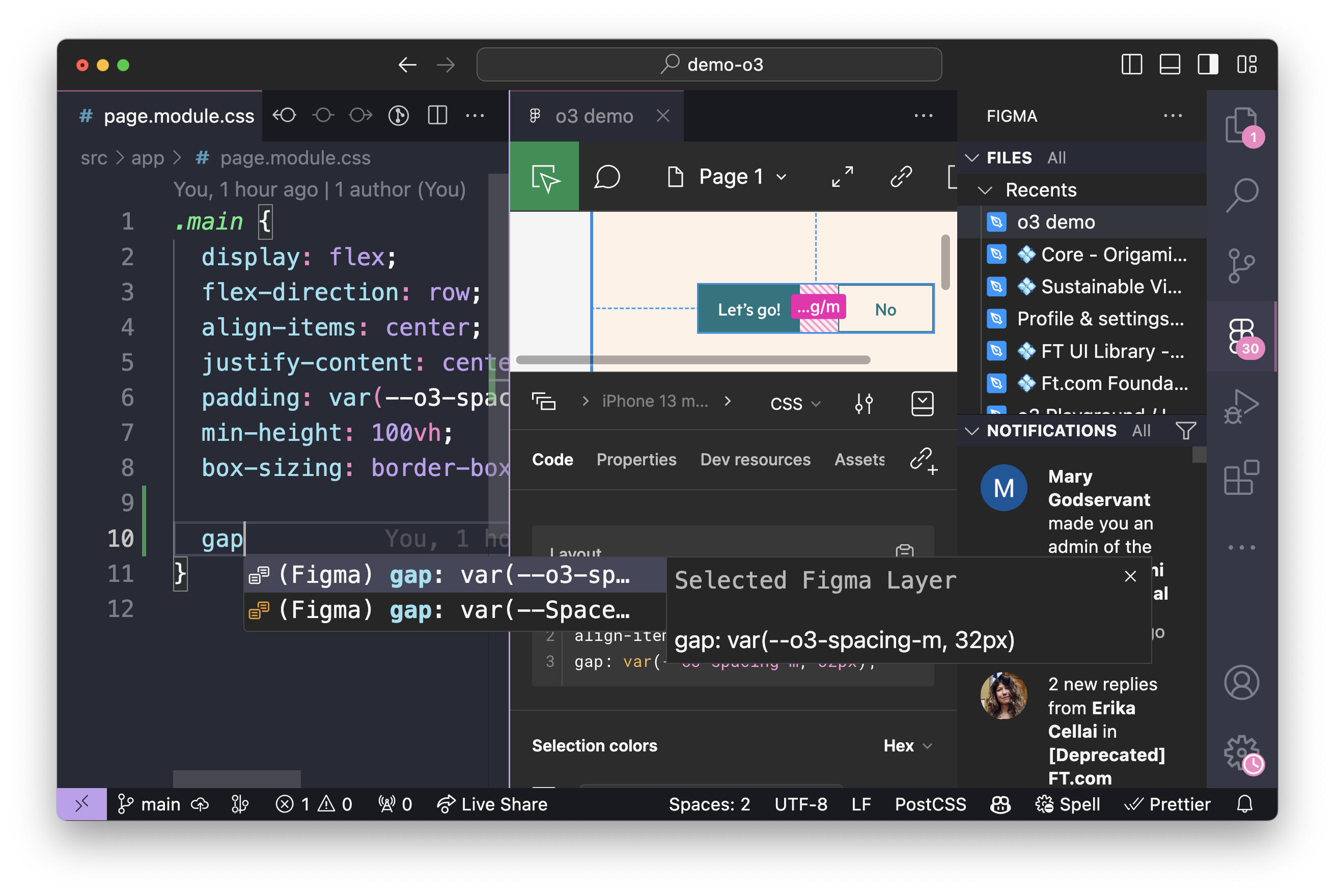
An engineer may choose to open your Figma design directly in their code editor. This provides automatic code completion based on the Origami tokens in your design.
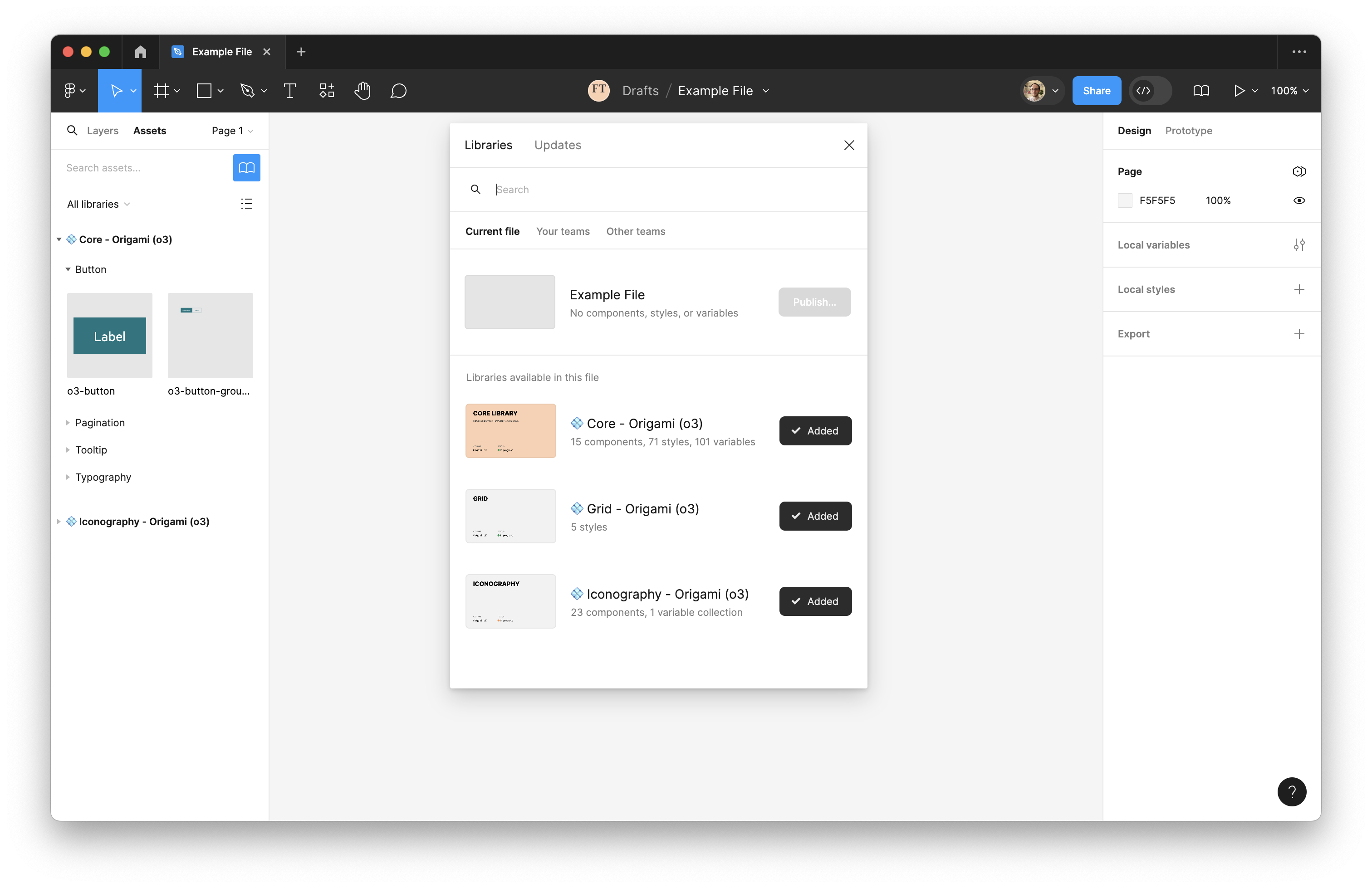
Figma Library Reference
As previously discussed, we have a number of Figma Libraries which may be enabled in your next Figma project. This section covers their content in more depth.
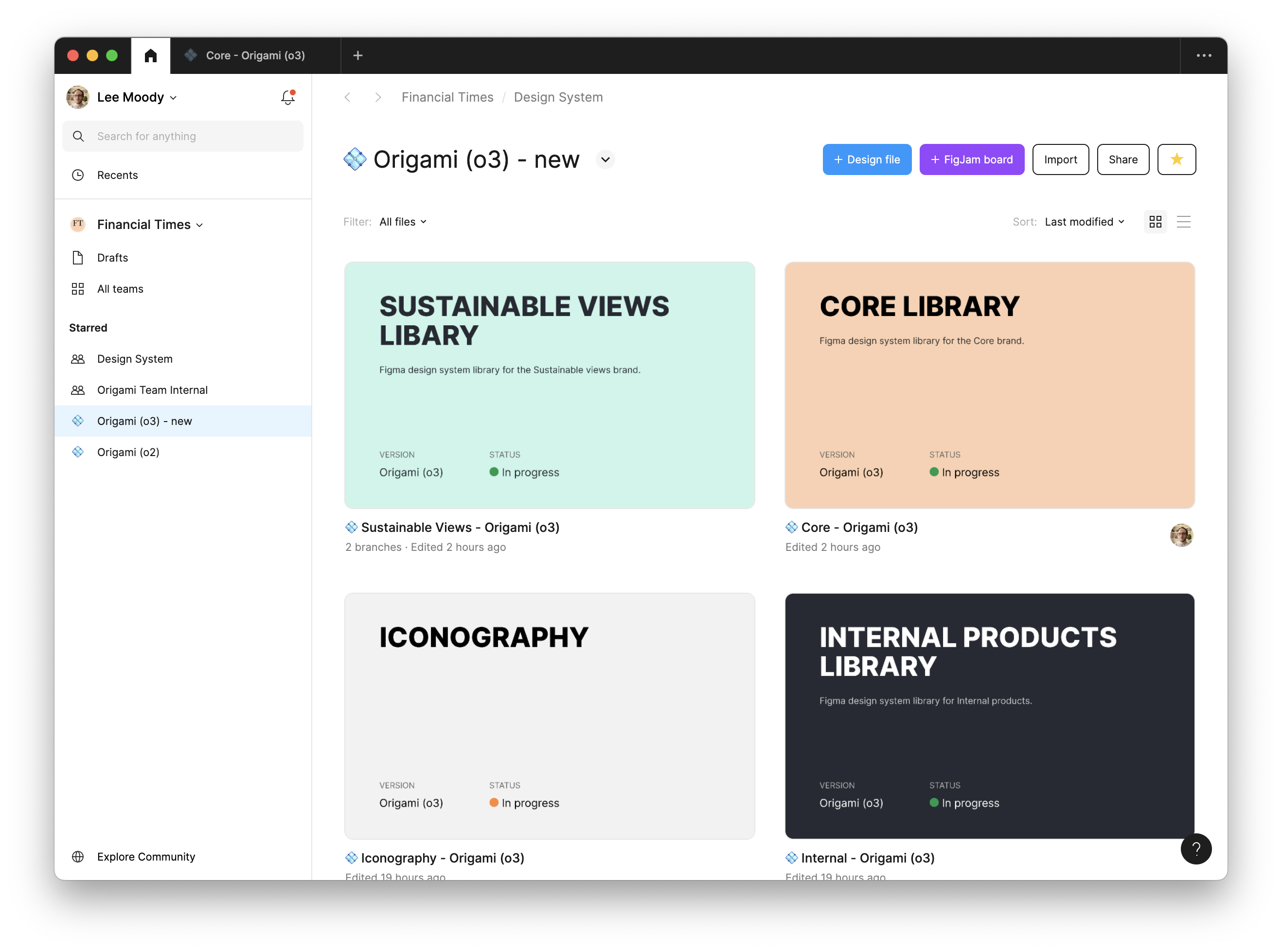
Origami (o3)
The Origami (o3) Figma project includes libraries for the latest evolution of Origami. This includes:
- A separate library for each brand Origami currently supports.
- Libraries which apply across all brands:
- Iconography
- Grid
- A whitelabel library with minimal style, this is the base for new brand libraries.
Origami (o2)
The Origami (o2) Figma project includes limited libraries. Unlike our latest Figma libraries these support the “core” brand only; are incomplete; and sometimes misleading. Please use with caution and always validate against o2 Storybook demos and existing live examples. See the “o2” design guide for more details.
Documentation Assets
The Documentation Assets Figma project aims to provide templates to help product teams maintain their own libraries alongside Origami. This is a work in progress. Please contact the team if you are interested in creating a library for your products.
Product Team Projects
We don’t want all the components to live within Origami. Origami is helpful to spread tried, tested, and thoroughly documented design patterns we want to encourage across the FT Group. But teams and brands still need to be able to experiment, do their own thing, with custom design patterns which augment Origami. Often these are even shared across a specific set of projects, and sometimes teams, outside of Origami.
Therefore we aim to support a “Neighbourhood” of libraries, maintained by different product teams, to augment Origami. Documentation Assets aim to provide some consistency and structure across these. As neighbourhood projects, these may vary in quality and care should be taken before using them. Please consult with the maintaining team beforehand.