Using Components (o3) via npm
Origami components are published to npm as Custom Elements, and other standards based web component technologies.
This guide aims to take you through the key steps to install and use Origami components. Familiarity with npm, CSS, and JavaScript is assumed. We also assume your project includes a build step e.g. webpack, vite, postcss.
If you are having difficulty getting Origami working for your setup, please reach out to the team. We can help you get setup and update our documentation as needed.
Install
To begin install @financial-times/o3-foundation as a peer dependency, along with any other Origami packages you need.
For example purposes we’ll include:
@financial-times/o3-foundation@financial-times/o3-tooltip@financial-times/o3-button
npm install --save-peer @financial-times/o3-foundation @financial-times/o3-button @financial-times/o3-tooltipIf you’re working on a component or similar project, which other projects will depend on, we recommend using a caret ^ version range when installing Origami components. This will help to avoid peer dependency conflicts. E.g. @financial-times/o3-foundation^1.2.0 would allow any version at >=1.2.0 <2.0.0.
Provide HTML
Origami supports multiple brands and themes. First set your brand using the data attribute data-o3-brand on a parent element. Optionally, apply a theme using the data-o3-theme data attribute. Supported themes are documented in a component’s Storybook.
<body data-o3-brand="core"> <!-- Your html --></body>Next we need to include the HTML for our components. We can do this in one of two ways:
- Import a JSX template from the component. Or;
- Copy-paste markup from Storybook.
We recommend JSX templates for React projects. This will reduce the number of markup changes required when upgrading to future versions of Origami; and provide markup autocompletion through type definitions.
HTML from Storybook
This example shows including a button which is described by an “onboarding tooltip”. It includes HTML copied from the HTML tab in Storybook:
<body data-o3-brand="core"> <button class="o3-button o3-button--secondary" id="demo-o3-tooltip-id" aria-describedby="o3-tooltip-content" > Example</button ><o3-tooltip-onboarding target-id="demo-o3-tooltip-id" content-id="o3-tooltip-content" title="Origami Example" content="This is for demo purposes only." role="tooltip" placement="top" class="o3-tooltip" ></o3-tooltip-onboarding></body>HTML via JSX
This example shows including a button which is described by an “onboarding tooltip” using the component’s JSX:
import {Button} from '@financial-times/o3-button';import {TooltipOnboarding} from '@financial-times/o3-tooltip';
<body data-o3-brand="core">  <Button    label="Example"    type="primary"    attributes={{      id: 'demo-o3-tooltip-id',      'aria-describedby': 'o3-tooltip-content',    }}  />  <TooltipOnboarding    targetId="demo-o3-tooltip-id"    contentId="o3-tooltip-content"    title="Origami Example"    content="This is for demo purposes only."    placement="top"  />;</body>;
Import CSS
Origami packages include component CSS for each supported brand /css/[brand].css. Import these to your CSS globally. For example, for the core brand:
@import '@financial-times/o3-foundation/css/core.css';@import '@financial-times/o3-button/css/core.css';@import '@financial-times/o3-tooltip/css/core.css';
body {  background-color: var(--o3-color-use-case-page-background);}
Import client-side JavaScript
Client-side JavaScript for Origami packages if referenced in the browser field of their package.json where relevant. These are Custom Elements (web components), which are defined automatically on import.
In our example, only o3-tooltip has client side JavaScript.
import '@financial-times/o3-tooltip';React compatibility
React users need to take extra steps to initialise component JavaScript using useEffect, and may need to ensure the correct resolution of JSX with a more explicit import. Here’s the same example for a default Next.js project:
'use client';
import styles from './page.module.css';import {useEffect} from 'react';// Import JSX templates.// Origami package.json specifies fields:// - `main`: JSX template as commonjs (cjs)// - `module`: JSX template as esm (esm)// - `browser`: client side javascript// When resolution based on these fields fails, we can specify "esm"// explicitly in our import to ensure Next.js resolves the correct JSX.// This is not required for every setup.import {TooltipOnboarding} from '@financial-times/o3-tooltip/esm';import {Button} from '@financial-times/o3-button/esm';
export default function Home() {  useEffect(() => {    // Run client side JS: define web components.    import('@financial-times/o3-tooltip');  }, []);
  return (    <main className={styles.main}>      <Button        label="Example"        type="primary"        attributes={{          id: 'demo-o3-tooltip-id',          'aria-describedby': 'o3-tooltip-content',        }}      />      <TooltipOnboarding        targetId="demo-o3-tooltip-id"        contentId="o3-tooltip-content"        title="Origami Example"        content="This is for demo purposes only."        placement="top"      />    </main>  );}
Although out of scope for this introduction, care must also be taken when working with objects as properties and events. This has been fixed in React 19.
Figma Dev Mode
Origami v3 (o3) aims to align Figma and our web implementation as much as possible. That means you can see at a glance which components a designer has used, what component properties (variants) they have selected, and what design tokens they have used e.g. for colours, spacing, and typography.
We recommend reading Figma’s documentation to get the most out of Dev Mode. However we’ll highlight a few key benefits here.
Figma Access
First ensure you have access to Figma’s Dev Mode. If not, request access from the Collaboration Tooling team.
Figma to CSS
Where a design uses a Figma Style or Figma Variable from Origami, you can copy this straight from Dev Mode.
The screenshot below shows an example design with Dev Mode enabled. By selecting the design we can see a CSS snippet which includes a real Origami CSS Custom Property --o3-spacing-m:
display: flex;align-items: flex-start;gap: var(--o3-spacing-m, 2rem);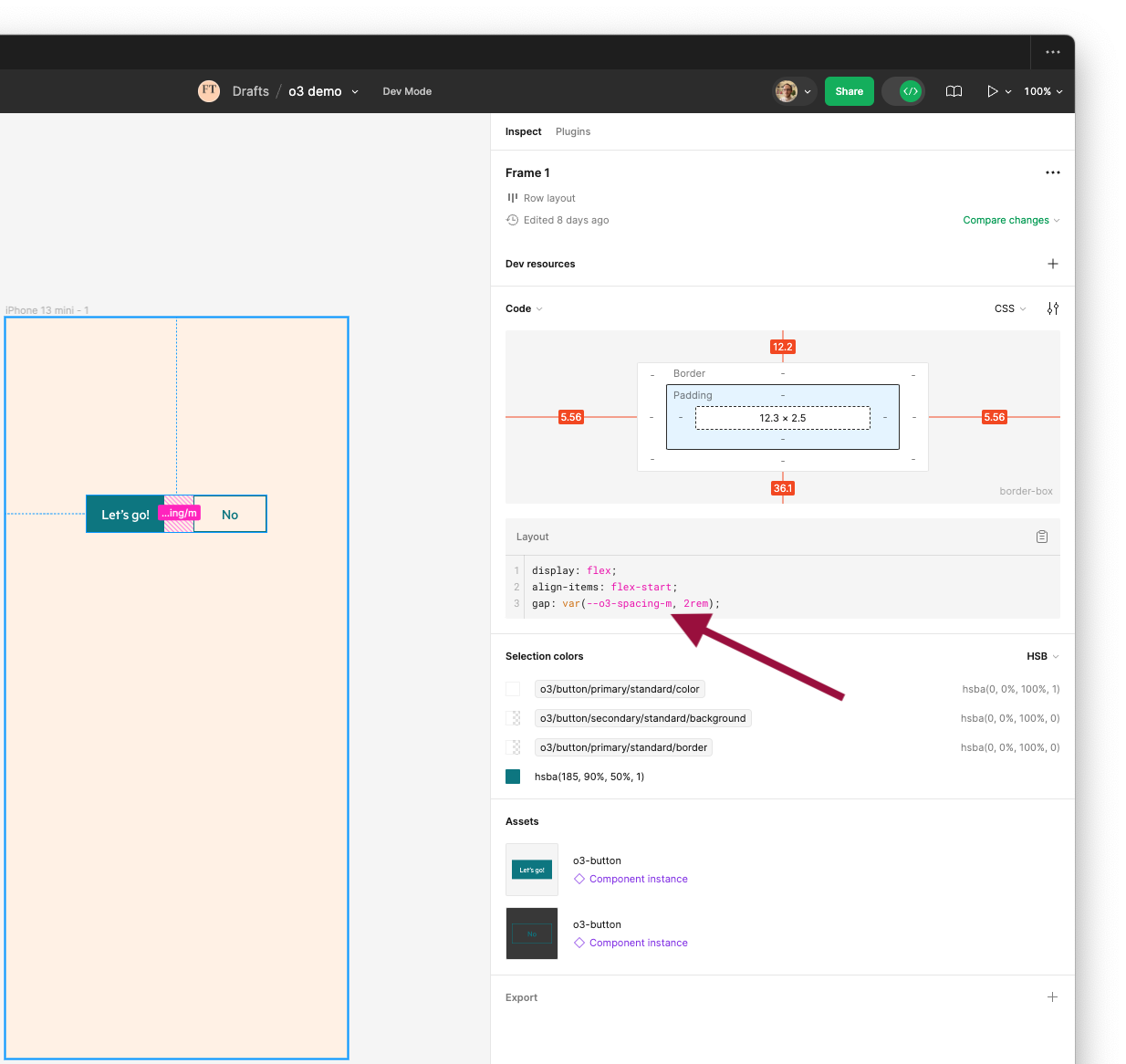
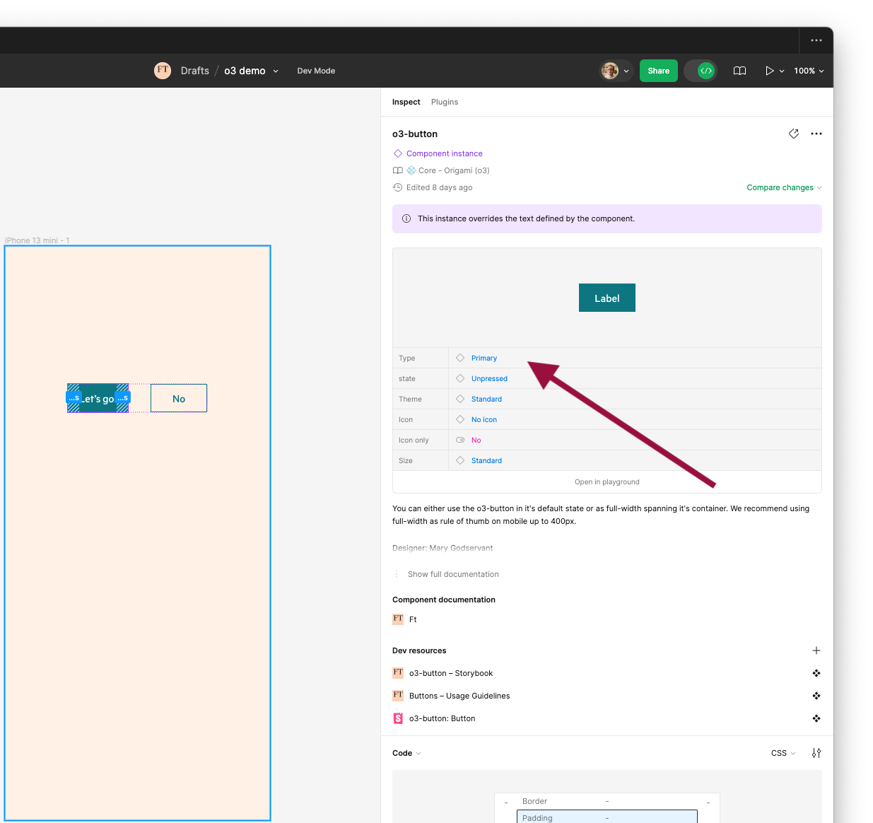
Figma to JSX
Where possible we align Figma Variants to our JSX properties. After selecting an Origami component in a design, you can reference these values when setting JSX properties.
In the following screenshot we have selected a button and can see we need to include a button with type='primary' set.
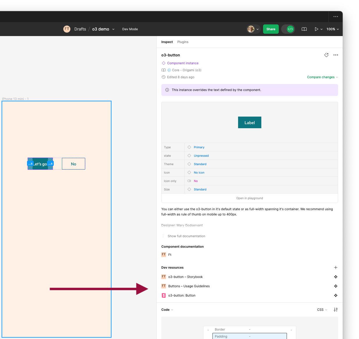
Figma to Storybook
After selecting an Origami component within a design we can also use Dev Mode to jump to design guidelines, Storybook, and any other developer resources.
VSCode extension recommendations
Figma For VSCode
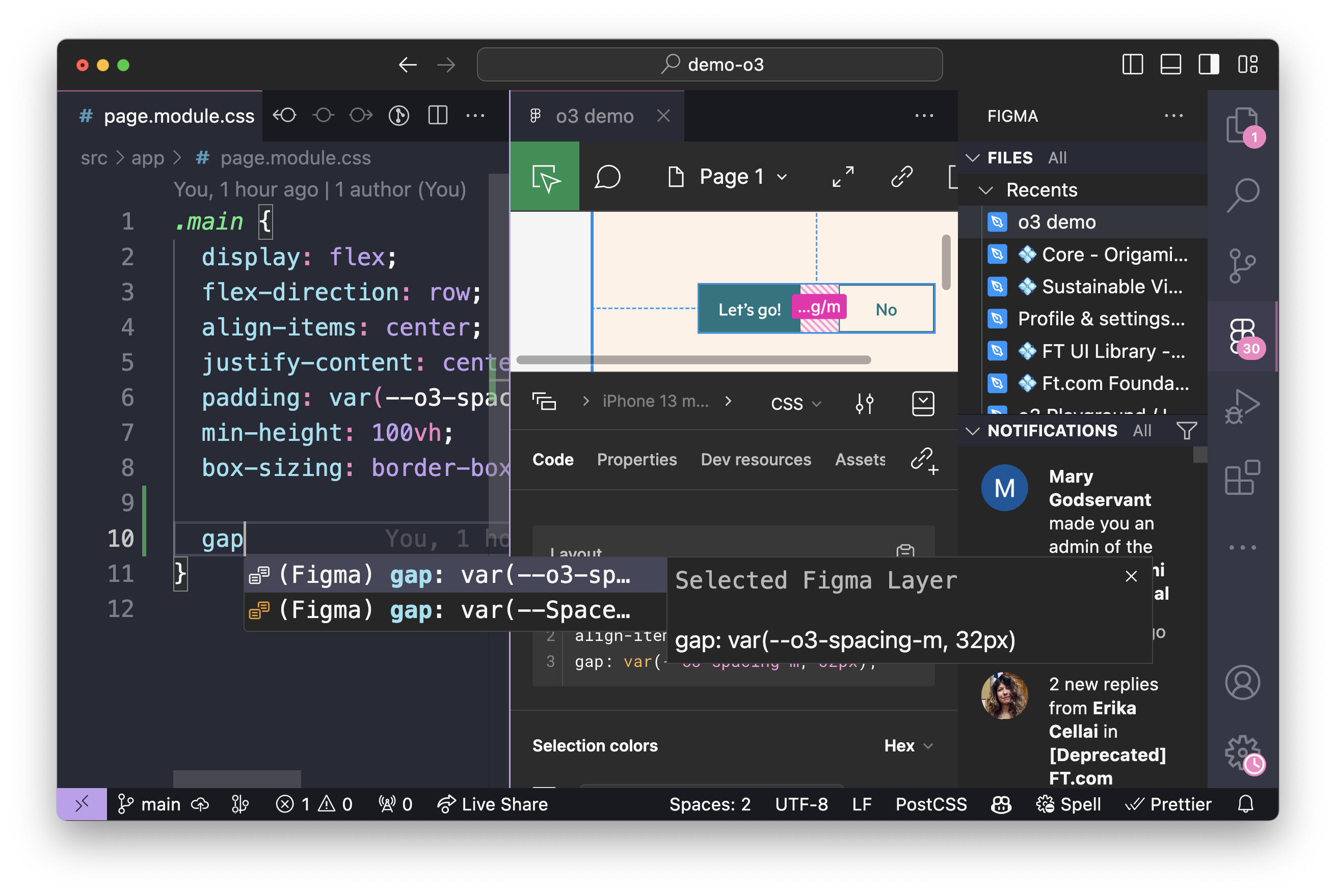
Similar to Dev Mode, Figma for VSCode allows you to navigate and inspect design files within your text editor. These benefit from code auto completion based on the selected design.
The following screenshot shows Figma For VSCode suggesting the --o3-spacing-m CSS Custom Property based on the selected Figma design.
CSS Variable Autocomplete
CSS Variable Autocomplete makes applying Origami foundations such as colours, typography, and spacing far easier as these are published as CSS Custom Properties. Instead of referencing documentation or design files, this plugin allows for autocompletion based on memory and search.
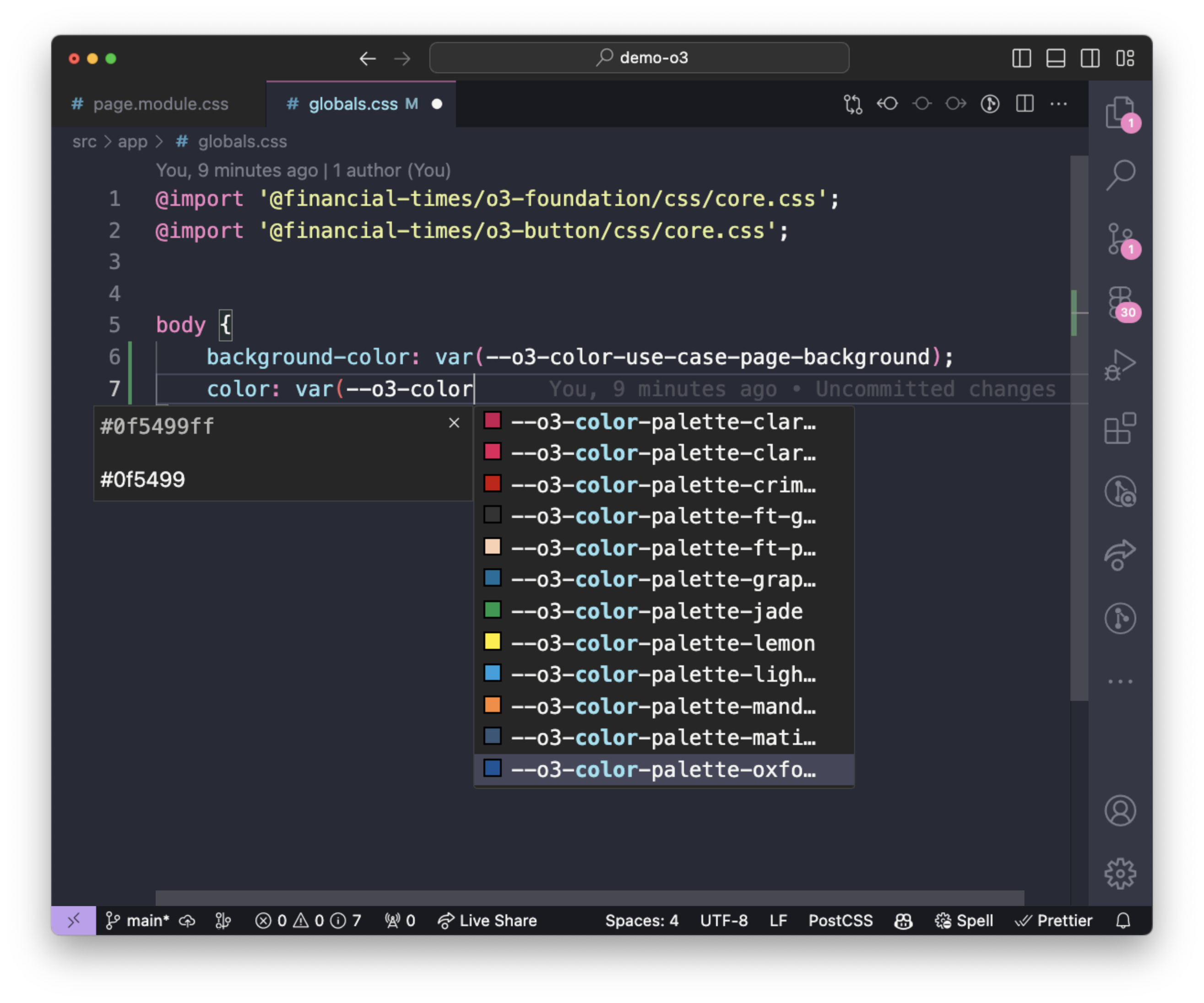
By default CSS Variable Autocomplete does not look for CSS in node_modules. We recommend setting its configuration to specify which CSS to use for autocompletion. This will vary per project. E.g:
{ "cssVariables.lookupFiles": [ "src/css/**/*.css", "src/scss/**/*.scss", "node_modules/@financial-times/o3-*/css/[your-project-brand].css" ], "cssVariables.blacklistFolders": []}