June Newsletter
TL;DR:We released new design guidelines for our grid system and editorial typography; we have new dashboards to maintain the reliability of Origami services; and we're putting together a launch plan for the new beta website, which puts Origami 3 and our new design guidelines front-and-center.
Top things
Some of the bigger Origami news since our last update:
New design guidelines
Grid
In conjunction with product design team, we have published new grid guidelines for Origami 3 (o3).
Without a consistent grid system the FT would be anarchy, from a design and usability perspective. We use a grid system to ensure consistency across different FT pages with a structured, balanced layout. It enhances readability and guides the reader’s eye. Regardless of who designed or built a given page, the grid system provides an FT experience.
For over 11 years, the FT have had guidelines for a systematised grid. However over the years the devices our readers use and the tools we use to create products have changed. Conformance to our grid system has fallen, and inconsistency across FT projects has grown.
Our updated grid guidelines are more comprehensive and, with a smaller number of columns for smaller viewports, more orientated to mobile design than before. We also have an accurate representation within Figma design tooling.
We’re continuing to gather real world feedback from designers and are working toward a co-ordinated rollout across existing ft.com pages for early 2025.
Editorial Typography
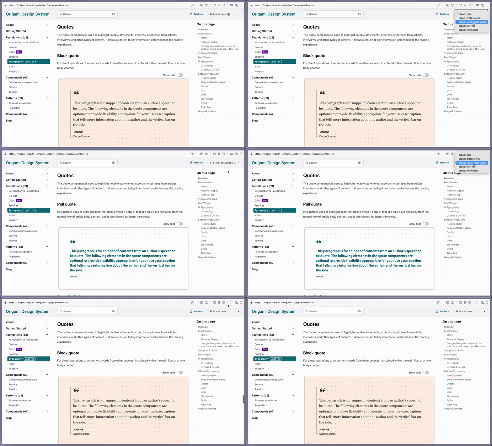
We’ve also released new editorial typography guidelines for o3.

As well as adding missing guidelines and quote styles along the way, we’ve implemented our new approach to branding and theming, giving us more comprehensive tooling for ft.com and the app. As well as, for the first time, support for a Specialist brand (Sustainable Views) 🎉
This work took us much longer than expected given the complexity and sensitivity of editorial typography. We had lots of food for thought after our retrospective on how to improve our process. We’ve begun creating a step-by-step guide to component creation with checkpoints along the way.
Website Launch Plan
As discussed during our previous update, our new beta website is coming along nicely and is almost ready to become the main Origami website. We’ve chosen to pause its rollout whilst we increase our confidence that it won’t cause disruption to existing users of Origami. Particularly as it shifts from Origami 2 to Origami 3 as the default view (see what’s new). We’ll be running some user testing, preparing workshops, and writing extra guidance for specific teams. We’ll appreciate your teams participation.
In the meantime, please reach out to the Origami team (#origami-support) if you’re getting started with Origami 3 (o3), so we can support you through early adoption.
Dashboards
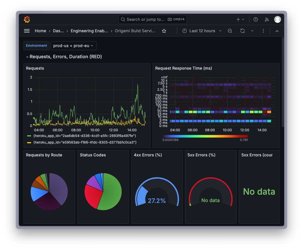
Last but not least, we have new dashboards for our services (image, build, navigation) which give us insights into how they’re performing.
These are all based on OpenTelemetry metrics. An initiative from the Edge, Delivery, and Observability team (EDO) as a first step to move the FT towards a standard method of producing telemetry – so we know what our systems are up to, and what might be going wrong.

Special Thanks
Our special thanks for June goes to Svetlana Angelova! Svetlana found a bug in our Origami 3 Pagination pattern. Her bug report (Slack) was comprehensive and pointed us right to the solution, so fixing was a breeze 🎉 Sustainable Views is winning the o3 adoption race. Their feedback and fixes are invaluable as we prepare for a wider rollout across Customer Products.
Broader update
A digest list of some other things that have happened since our last update:
- Major: o-header v13 includes a whole bunch of design improvements to the search and internal edition switcher interface. Pulling in larger, standardised form and button elements; improving spacing and position for usability. Thanks to the Content Discovery team (Daniel Ruiz, Jazmin Batisti, Luke Kavanagh) for their work there. See the o-header migration guide to update your project.
- Major: o-comments v11 resolves an issue regarding a feature to report illegal comments, for compliance with the the EU’s Digital Services Act. Thanks for the excellent PRs there, Dawn Budge! They’re always very easy to understand and review.
- Beta website: We’ve improved brand management, deleting hundreds of lines of duplicate content. This allows us to focus our main effort on our “core” brand (a.k.a FT Pink), whilst still providing a level of support for both Internal and Sustainable Views brands. This keeps us moving toward a future where Origami can provide for many FT Group brands as a shared capability.
- Origami Neighbourhood: In our previous update, we discussed the need for a neighbourhood of Figma libraries that support design guidelines and reusability outside of Origami. Mary presented a neighbourhood proposal to the design system guild, and confirmed collaboration with Sam Pennington from the apps team to test out this idea 🙌
